10 Author Websites and Why They Work
Author websites are one of the most powerful marketing tools at a writer’s disposal. But what makes a good, even great one? Let’s take a close look at some author websites that work to see exactly why they work so well, and what you can do to make your own author website work just as effectively.
Author websites are a great marketing tool. Devote some time to making yours the best it can be.
Whether you’re a published author or still on the submission trail, you need a marketing strategy that gives your writing the best chance to succeed. Let Good Story Marketing help you confidently stand out from the crowd with a personalized plan for building your author platform or supporting your existing published works.
What makes for great author websites?
Branding
Branding is what makes you stand out, instantly recognizable, giving shape to your unique place online. Beyond merely borrowing colors and fonts from your book cover, it’s the entire communication your website sends about you and your work. The way you use all the design and content tools available to you sets you apart from every other author out there, even within your genre. Especially within your genre.
Ease of Navigation
Well organized content presented in a logical fashion that leads visitors strategically through author websites to the information you want them to find. It can be a tidy menu bar, but it can also be presented in a style that’s as much part of your brand as the site’s aesthetic.
Clarity
Beyond ease of navigation, clarity is about not overwhelming site visitors with busy design or too much disorganized information to make sure they know exactly what you’re all about, and where they can go to buy your books… which leads us to…
Author Funnel
Author websites a great place for visitors to learn more about you, but it has another purpose – to sell books. The concept of a sales or marketing ‘funnel’ is that the site is designed to lead, or funnel, visitors through a through the site in a way that achieves a pre-determined goal - to get them to buy your book, or opt-in to your newsletter, or register for a webinar you’re offering, or enter a giveaway contest. There are so many ways to build an audience. Of many sites that have carefully considered this theory in their design and content, Mark Manson’s is included in our selection below as one clear example.
SEO
SEO, or Search Engine Optimization, isn’t as difficult or confusing as it sounds. It’s simply a method to ensure that your site is more likely to get placed at the top of Google searches. Over 50% of all traffic online comes from search engines, so it’s worth getting this right. There are 3 simple ways to achieve this:
Valuable, interesting, interactive content
Optimized with keywords
Which makes other sites link back to it
To create content that is optimized for SEO, consider what the best answer to a relevant search query typed into a search engine might be, and then deliver on that promise.
SEO keywords theory doesn’t have to be difficult. For a start, the name “keyword” can be a bit misleading, because it’s really more of a keyphrase. As an example, the keyword for this blog post is “author websites.” See? Not that hard. Try to repeat that keyphrase in the title, and several times throughout the blog post.
If you still think this is too much for you and your site is built on the Wordpress platform, there’s a free plugin called Yoast SEO that can do all the legwork for you. All you do is type in the keyword you want to rank on Google into the “focus keyphrase” box and follow the little red and orange suggestions until the “SEO Analysis” tab turns into a green smiley face. Without the benefit of that easy tool, consider a phrase that is most likely to be typed into a search for the topic you’re writing about, and be sure to repeat it as many times as you can within the body of the text.
Backlinks are one of the most important ranking factors to Google, and basically means getting others to link back to your website, thereby extending your reach and influence. You can get backlinks through creating shareable content and getting interviews, asking to be featured, and/or simply reaching out to others. If you make awesome content, others will want to link to it, and the more authoritative the sites that link back to you are, the better. It works much the same way as post shared by an “influencer” on social media sites.
Author websites as a connection to Fan Resources
As you can hopefully see now, the value you provide to visitors when they arrive on your site, working in tandem with SEO and a powerful funnel, depends on great content. Author websites that contain a lot of engaging content tend to keep visitors on the site longer, and the more time they spend there, the more likely they are to opt-in, remember you, and become a book buyer.
You could read parts of your book and post them to video or podcasts, create giveaways, host fan-art boards, or contests – the point is to create an engaging content strategy and stick to it. Video is becoming increasingly important on the internet. Find ways to use it if you can. Observe how other successful author sites use it and find the one that works for your brand and comfort level.
About You
Your About page and Media page can either be combined or separate – you choose. The About, or Bio page is your virtual handshake extended to the reader — a way to connect with site visitors in much the same way as when meeting someone for the first time in a real life social setting. It’s usually preferable to come across as relatable, informed, interesting, and appealing - rather than dry, pedantic, or self-aggrandizing. As far as bios are concerned, it’s a good idea to provide a short “soundbite” sized version, a medium “elevator ride” sized version, and a longer “chat by the fireside with a glass of wine” version.
For press and media purposes you’ll also need to include high resolution photos of yourself in a variety of formats and sizes. If you have a publicist or public relations assistant, this may be a good place to give their name and contact information. Some author websites below to put this information on the Contact page instead. Some include it on a dedicated Media page, separate from both the Bio/About page and the Contact page. It’s your choice, just make it easy to find.
Bonus tip: To keep visitors on your site longer, add links to other blog posts or areas of your site to tempt visitors to get to know you and your work better.
So now that you know a little bit about the theory of a great author platform and why they work, lets explore a few examples, in no particular order…
RANSOM RIGGS
Fantasy
Features: Quirky, Fun, Displays Unique Skills
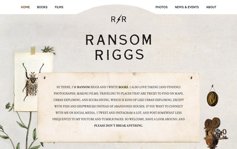
If a time travelling 19th century antiquarian had a website, it would look like Ransom Rigg’s site, which if you know anything of his work, is entirely in keeping with the themes of his work. The different illustrations on the home page are navigational links to different pages on the site. Even the introduction on the homepage is “in character.”
MARK DAWSON
Thriller
Features: Bold Branding, Focused Opt-In
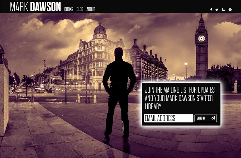
From the landing page you’re in no doubt about this writer’s genre. A man silhouetted against a dark, gritty image of London lets you know right off the bat that he writes thrillers set in London. Social media links are displayed at the top of the home page. Crisp, decisive lines with high contrast compels you to interact with the focused and appealing calls to action. This site knows what it’s trying to achieve, and succeeds. If I have one criticism, it’s that the blog is too high contrast for comfortable reading.
MARK MANSON
Non-fiction, Lifestyle, Self-help
Features: Great SEO Strategy and Funnel, Memorable style, Content
Mark Manson’s site is much like his writing – direct, vital, and packed with great content. Bursting with his trademark insouciant attitude, the site funnels visitor experience and SEO features through multiple tiers of content membership. You can opt into his blog to unlock VIP content, and pay a little extra for an insider circle as well. He gets a lot of quality links from other websites and gets an estimated 250,000 organic visits a month. Study this one carefully – it’s a fun, clever site that does its job brilliantly.
LEIGH BARDUGO – GRISHAVERSE
Fantasy
Features: Engaging Fan Resources, Stylish, Fun
The site is as much fun as the Grishaverse, with liberal use of illustrations, textures, decorative fonts, and fan resources that compliment her brand. It’s easy to navigate, well-crafted, engaging, and immersive, providing an irresistible invitation to her original world.
N.K. JEMISIN
Adult Fantasy, Sci-Fi
Features: Minimalist, clear CTAs
If you’re looking for a minimalistic approach to your author website, look no further than N.K. Jemisin. The home page is super straightforward (when you have an amazing pull quote like that, what more do you need, really?), with just three buttons that clearly show you how to navigate the site. Typography is clean (and matches her book covers) and nothing is overwhelmingly detailed!
DAV PILKEY
Children’s
Features: Zany Engagement Overload, Playful
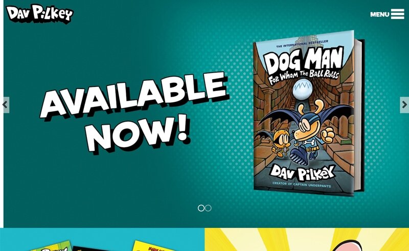
Bristling with interactive content to keep kids coming back, Dav Pilkey’s site understands his fans. The site is bold and clean, with colors, illustrations, video, and fonts enhancing the lively content. This is one example of a site using a video book trailer. These can sometimes be lame, but when they work well they’re unbeatable sales tools.
JAMES ROLLINS
Crime Thriller
Features: Atmospheric, immersive
James Rollins’ previous website, while aesthetically striking, was marred by the confusing method of navigation which made it hard to discover all the great content – but his new site focuses almost entirely on the extensive navigation menu, which drops down in anticipation as your mouse goes up to the top of the page to look for it. There’s no denying the immersive effect of the atmospheric, parallax header image — you feel like you’re inside his story, and the slightly disorienting effect of the shadowy parallax header image, with its lettering in Latin and aged book spines, lets you know the journey is going to be both mysterious and intelligent.
ALEXANDRA BRACKEN
Young Adult
Features: Clean, fresh, youthful design, opt-in friendly
Despite a dizzyingly extensive and varied body of work, the clean site creates a cohesive framework to display her book covers, with call to action buttons inviting preorders, and a clear opt-in featuring the newsletter sign up. Navigation is clear, a variety of high resolution author photos is provided and the author’s energetic social media platform is front and center.
http://www.alexandrabracken.com/
DEBORAH HARKNESS
Adult historical fantasy
Features: Content rich, press and media page
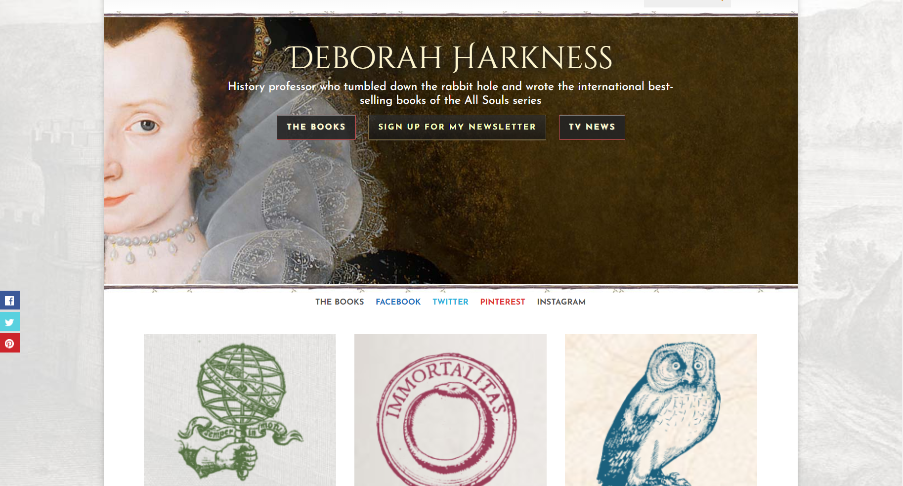
Although the site design itself is not particularly innovative, this is a site in which content is king for authors websites. Considering that the author is a history professor, this makes a lot of sense and gives a clear impression of who she is as a person. The dedicated press and media page features a contact form providing ways to reach her various agents and PR professionals. This is a site that means business and knows its audience.
SHEL SILVERSTEIN
Children’s poetry
Features: Animated navigation, playful hand-drawn design
You don’t have to use a lot of color to get attention. The first item in the navigation menu bar is “fun” and that is certainly what this site delivers. The limited palate of black and white hand-drawn elements makes the red call-to-action buttons stand out and the content invites teachers, librarians, and school children to have a “Shelebration in your classroom” in addition to providing a huge variety of rich classroom content on the Learning Resources page. Interactive elements like e-cards and book trailer videos are great, but the uniquely memorable element is the playful, animated menu. Go visit the site and try for yourself. You’ll be enchanted and inspired.
http://www.shelsilverstein.com/
In Summary
As you can see, there are many ways to make author websites stand out while providing a way for readers to feel connected to you. The trick is to adapt these tools to present yourself and your work in a way that’s uniquely memorable.
If you know of any other author websites that deserve a closer look, feel free to share links in the comments!
Marketing services for writers are essential if you’re looking to reach audiences and stand out on shelves. Whether you’re looking to build your platform ahead of publication or already have a book out, we can help with marketing strategy and even do the heavy lifting. Reach more readers, build an audience, and increase your visibility. Good Story Marketing plans and services can help you achieve your goals and tell your story to the world!


